
Data in a New Dimension
Using augmented reality to concisely visualize a large dataset for a general audience.
My Role
Ideation
UX/UI Design
Visual Design
Data Analysis
Prototyping
Unity
ARFoundation
iOS development
User testing
Team
Self
Timeline
15 weeks (Master’s Thesis)
Background and Ideation
Visualization is key for helping people understand the implications of big datasets. However, traditional methods of data visualization (e.g. bar charts, line graphs, scatterplots) often fail to capture attention or interest because they are seen as uninteresting or difficult to understand. Creating striking, dynamic data visualizations that present data clearly while remaining engaging is crucial to helping inform viewers.
Augmented reality (AR) has reached a point where it is accessible on common consumer devices like tablets and smartphones. AR affords many possibilities to enhance the data presentation: movement, sound, three-dimensionality, and real-time adjustment of features.

The Problem
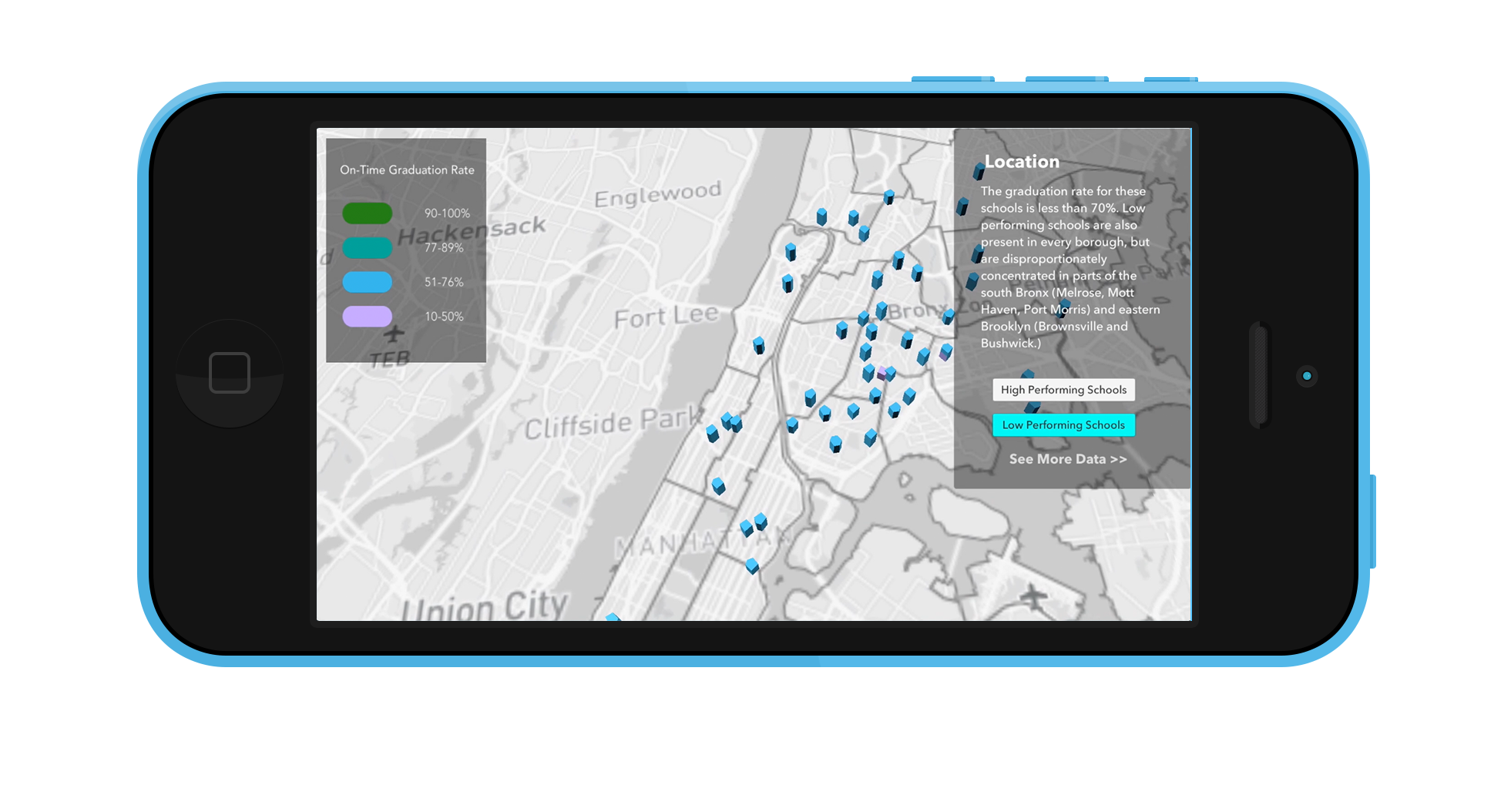
New York City has the largest school district in the United States. It also offers school choice, which means that all incoming high school freshmen must apply to high school, ranking their choices out of over 400 available schools and more than 700 programs, and may attend school in any borough.

While that information in itself might be overwhelming, it doesn’t stop there: different schools use a variety of different admissions methods, from random admission to screened schools or those that require a high-stakes test, the Specialized High School Admissions Test (SHSAT). There is a wide chasm between the (mostly highly selective) well-performing schools and the schools that rely on open or random admission when it comes to graduation rate and other crucial educational outcomes, so where students choose to go to school matters.
The existing infrastructure for guiding parents and students through this process is the Directory of NYC Public High Schools, a 600 or so page book that gets sent out to eighth graders and their families every year, which, while detailed, is not a concise way to communicate information.
Due to the geographical component of school choice, especially in New York where students may attend school in any borough, I thought that using AR to show school data on a map of New York City would be a good way to showcase the data, as it would give parents an overview of all the choices while still allowing them to filter by neighborhood, school performance, and admissions type.
Data Collection
I used data from the DOE High Schools Directory and the New York State Education Department, and then merged in demographic data that was available on NYC Open Data.
A preliminary analysis of the data showed trends in school performance based on location, so I thought it was important to include information about the community districts in my visualization. Using the NYC Planning Community District Profiles, I created a dataset of community district income level, and combined all of this data into a custom map in Mapbox Studio.
Prototyping

I created a quick prototype for the AR interaction in Adobe XD before moving into Unity. I used the Mapbox SDK for Unity to import my custom map and map styles, and used the built in Unity UI tools to create the GUI.
Usability Testing
I conducted remote validity testing of my app by recording a video of the interactions and requesting structured feedback. I specifically asked users about:
What was being represented in each interaction (if they could tell me what the colors/ shapes represented, specifically)
If there was anything they didn’t like / found confusing
If there was any information they wish had been included but wasn’t
Their overall impression of the experience
Key Takeaways:
Many people commented asking for clarification on the use of color, contrast of text to button color, and asking for a reduction on the harshness of the shadows.
Everyone requested the ability to tap on a school to get the name of it.
I received positive feedback on the idea and interactions, and was able to make some aesthetic changes to clarify the data as well as add the ability to tap on the school buildings to get their names. I ended up splitting the interaction into three parts (Location, Income Level, Admissions Method), so that the user would only be asked to focus on one piece of changing data at a time, to minimize cognitive load.
Final Design


Future Steps
Moving forward with this project, it would be great to incorporate more information about each school in their info card on tap (e.g. specially offered programs, state regents performance, extracurriculars). I would also like to give school administrators the opportunity to include a “sound bite” that could be played on tap that speaks to what is unique and great about their school.
It would be interesting to incorporate GPS with this application to locate the user in world space, so that when they open the app they are shown schools that are geographically nearby.
Finally, it could be useful to integrate this app with community organizations that help parents and students navigate the high school process.